
Preface
No, this is not the first sample to be found in the internet on this topic. Anyway, I decided to add another one because the two I was looking at (see links below) gave good ideas, but did not satisfied me at all.
Changes to App.xaml.cs
To begin, new items need to be added to the settings charm somehow. I did this by changing the app.xaml.cs. This is my starting point here.
First thing is to add a new using statement:
using Windows.UI.ApplicationSettings
Next, we need to know when to add our items to the settings charm. The class SettingPane has an event called CommandsRequested, which “… occurs when the user opens the settings pane. Listening for this event lets the app initialize the setting commands and pause its UI until the user closes the pane.” (description copied from MSDN docs).
So I added an event handler as the last statement of the App.OnLaunched method.
SettingsPane.GetForCurrentView().CommandsRequested
  += OnSettingsCommandsRequested;
The handling method OnSettingsCommandsRequested is implemented in this sample like this:
private void OnSettingsCommandsRequested
  (
  SettingsPane settingsPane,
  SettingsPaneCommandsRequestedEventArgs args
  )
{
  args.Request.ApplicationCommands
    .Add(new SettingsCommand("about", "About", OnSettingsInvoked));

  args.Request.ApplicationCommands
    .Add(new SettingsCommand("popupHeaderBackgroundSlidesIn",
     "Background slides in", OnSettingsInvoked));

  args.Request.ApplicationCommands
    .Add(new SettingsCommand("popupHeaderWithoutTransition",
     "Header without transition", OnSettingsInvoked));

  args.Request.ApplicationCommands
    .Add(new SettingsCommand("popupHeaderWithTransition",
     "Header with transition", OnSettingsInvoked));
}
As you can see, no matter which command is selected by the user, the method OnSettingsInvoked is called. Because the SettingsCommand constructor takes a settingsCommandId as first parameter, I am able to distinguish between the actions to be taken inside OnSettingsInvoked. Of course, one can also implement different handlers for each new command. I decided to us a single one in this sample because the action to be taken is very similar.
private void OnSettingsInvoked
  (
  IUICommand command
  )
{
  // Get the command id.
  string commandId = command.Id as string;

  // Has to be set, otherwise return.
  if (commandId == null)
  {
    return;
  }

  switch (commandId)
  {
    case "about":
      OpenSettingsPage<AboutPage>();
      break;
    case "popupHeaderBackgroundSlidesIn":
      OpenSettingsPage<HeaderBackgroundSlidesInPage>();
      break;
    case "popupHeaderWithoutTransition":
      OpenSettingsPage<HeaderWithoutTransitionPage>();
      break;
    case "popupHeaderWithTransition":
      OpenSettingsPage<HeaderWithTransitionPage>();
      break;
    default:
      break;

  }
}
The magic of opening a settings popup page is encapsulated by the method OpenSettingsPage<TPage>. It takes a type parameter to know what kind of popup page should be created. The type needs to be derived from SettingsPageBase to make sure the correct kind of page will be opened.
private void OpenSettingsPage()
  where TPage : SettingsPageBase, new()
{
  SettingsPopup = new Popup();

  SettingsPopup.IsLightDismissEnabled = true;
  SettingsPopup.Width = App.SettingsPopupWidth;
  SettingsPopup.Height = Window.Current.Bounds.Height;

  // Add the proper animation for the panel.
  SettingsPopup.ChildTransitions = new TransitionCollection();
  SettingsPopup.ChildTransitions.Add(new PaneThemeTransition()
  {
    Edge = (SettingsPane.Edge == SettingsEdgeLocation.Right) ?
           EdgeTransitionLocation.Right :
           EdgeTransitionLocation.Left
  });

  // Create a SettingsFlyout the same dimenssions as the Popup.
  TPage settingsFlyout = new TPage();
  settingsFlyout.Width = SettingsPopup.Width;
  settingsFlyout.Height = SettingsPopup.Height;

  // Place the SettingsFlyout inside our Popup window.
  SettingsPopup.Child = settingsFlyout;

  // define the location of our Popup.
  SettingsPopup.SetValue(Canvas.LeftProperty,
    SettingsPane.Edge == SettingsEdgeLocation.Right
    ? (Window.Current.Bounds.Width - SettingsPopup.Width)
      : 0);
  SettingsPopup.SetValue(Canvas.TopProperty, 0);
  SettingsPopup.IsOpen = true;
}
It is worth to mention that SettingsPopup is a property of the App class. When implementing my first settings pages, I made this a local variable. But whenever I clicked somewhere into the main window while the settings page was open, my app crashes. I was not able to debug the problem. Even no UnhandledException handler helped me out.
SettingsPageBase
To avoid copy & paste development for the back button click handler, I created a base class for the settings pages. This is the class SettingsPageBase, located in the Common folder. The handler’s task is to close the Popup and re-open the settings charm when the back button is pressed.
protected virtual void OnGoBack
  (
  object sender,
  RoutedEventArgs args
  )
{
  // First close our Popup.
  Popup parent = this.Parent as Popup;

  if (parent != null)
  {
    parent.IsOpen = false;
  }

  // If the app is not snapped, then the back button shows the Settings pane again.
  if (ApplicationView.Value != ApplicationViewState.Snapped)
  {
    SettingsPane.Show();
  }
}
Mastering the Transition
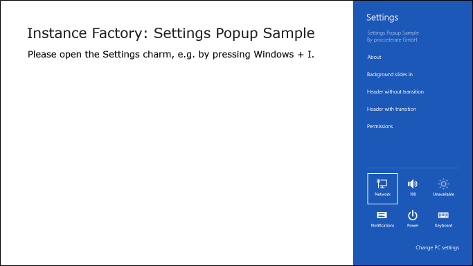
When you open up the settings charm of this sample app, you will notice three different settings items: “Background slides in”, “Header without transition”, and “Header with transition”. You might ask why this. The answer is, that these are the three kinds of transitions I noticed when I was starting with settings pages. And it took me a while to figure out why my first attempts did not look the way I expected it (Header with transition).
Background slides in
When you open the “Background slides in” page, look at how the header block behaves, especially the background. It slides in, together with the button, text and logo. So when the page pops in, there is a tiny block on the left where the background color is the page’s background, not to the header’s.
The header controls slide in as expected, together with the content of the page, but that did not satisfied me. So I dig into the samples, because they did not behave that way. There, I found the next version:
Header without transition
On this page, the background of the header is set correctly. No slide in. But also, no slide in of the button, text, and image. Their position is fixed in relation to the upper left corner even when the page opens, while the describing text slides in. So still not satisfied (and not comply with the UX requirements).
Header with transition
This is the way I like it. The background is not sliding, while the header’s controls do, together with the page’s content.
To get this done, I had to change different things. When you find an easier way, I would be happy if you post it in a comment.
First, the root element of the page must not contain any Transitions definition. So no child element will slide in by default.
The settings pages consists of a Grid having two rows. One for the header, one for the content.
I put two Grids into the header row. The first, without transition, to have the background be in place when the page pops in. The second, containing the back button, text, and image, with a transition definition:
<Style x:Key="SettingsHeaderContentStyle" TargetType="Grid">
  <Setter Property="Transitions">
    <Setter.Value>
      <TransitionCollection>
        <EntranceThemeTransition/>
      </TransitionCollection>
    </Setter.Value>
  </Setter>
</Style>
This makes sure only the content of the header will slide in.
And because the root element of the page does not contain any transition definitions, also the content part, which is a StackPanel in the second row of the main Grid in my sample, needs the same transition definition.
All application-specific styles can be found in Common/ApplicationStyles.xaml.
UX Design Requirements
This app satisfies the following UX design requirements (all copied from Windows 8 User experience guidelines):
-
Place your settings Flyout on the same side of the screen as the charms. The charms and the settings window may be on the left side of the screen if the system’s text direction is right-to-left (like Arabic).
Settings Flyouts should be narrow (346 pixels) or wide (646 pixels).
Settings Flyouts should have a header that includes a back button, the name of the entry point that opened the Flyout, and the app’s icon (small one, 30x30px).
Use a light-dismiss surface, so that the settings Flyout disappears when the user touches anywhere on the screen outside of the surface.
The Dev Center sample “Settings Flyout” names a few more requirements, which I was not able to find in the guidelines. But they all seem reasonable, so I will list them here too:
-
Height has to be 100% of the screen.
Header is 80px high.
Header’s background must match the start tile’s background (from the manifest).
Flyout’s border must be darker than the header’s background (80% of its value). For instance, the background color in the example below is #999999, so the boarder color is rgb(0.8 * #99, 0.8 * #99, 0.8 * #99), which is rounded to #797979a.
The background of the main content area must be white. This can cause a problem if your app requests the dark theme; the text foreground color is white in the dark them, which renders it invisible when the background color is white. To request the light theme, set
RequestedTheme="Light" in the app.xaml.
Both of the header’s and content’s controls must be animated.
The Sample Code
… can be found here. To build an run the sample, you need Windows 8 and Visual Studio 2012.
Links
Guidelines for app settings (Windows Store apps)
Store apps UX Guidelines Index
Dev Center Settings Flyout sample
Dev Center App settings sample (Windows 8)